When it comes to your business'branding strategy, establishing your company's logo is one of the most critical tasks.
在你所有的你的标志将会无处不在marketing campaigns, and it's one of the most prominent branding elements that people will think of when someone mentions your company.

Mounting research backs up how important a logo can be to your brand. In fact, a2019 study from the Journal of Marketing Researchfound that an effectively designed logo can "influence brand evaluations, purchase intentions, and brand performance."
Your brand's logo should be memorable, versatile, and consistent, all the while giving your audience a sense of what your brand is all about.
Unfortunately, many companies haven't exactly done a great job of keeping those goals in mind when establishing their logo, learning the hard way what it takes to create a positive brand experience through their logo.
Not sure what it takes to create a killer brand logo? To give you a better idea, here are 10 companies that have either failed or flourished in the logo department.
Memorable Logo Designs
KFC's Unique Logo Redesign & Launch
In 2006, KFC launched a new logo, changing the Colonel's appearance so he was pictured with a new, red apron. This was a big deal for the company, as its logo hadn't been changed in over a decade.
So why did they make the decision to revamp their logo? They wanted the image of the Colonel to be clearer and more energizing. The new, rejuvenated logo demonstrated an excitement and readiness to cook and serve.
Even better, KFC launched its new logo with the help of a HubSpot customer,Synergy Events, who constructed the logo from 65,000 one-foot-square tiles laid out in the Mojave Desert, which can be seen from space.

Apple's Perfect Logo Rebrand
Today, we think of the Apple logo as a simple but sleek design, representative of the Apple brand. But it wasn't always that way. The logo originally had a picture of Isaac Newton sitting under an apple tree. Eventually, it was changed into a rainbow picture of an apple. And finally, it changed into the logo we know and love today.
To give you an idea of how the logo has gotten simpler, yet sleeker, here's an image that shows its evolution up through 2015.

And today, this is the Apple logo we see regularly.
![]()
Apple is often the model for a great brand experience. The logo evolution demonstrates something that every company wants to convey: simple, inviting, and beautiful. All of the Apple products focus on giving its customers a great experience through a sleek interface.
Google's Successful Rebellion Against Logo Design Best Practices
Surprisingly, some of the classic Google logos have gone against a few standard branding rules. They've used colors that seem to clash with each other. There were a slight drop shadows in older logos, which is something logos aren't supposed to have. It one point, it used a serif font, which is hardly unique, and very rare for a logo to have.
However, Google's logos have been incredibly memorable for breaking the mold and standing out. Here'sjust one of Google's logos, which was part of its branding til roughly 2015.

And, here's what Google's logo looks like today.

The rest of Google's applications also have fantastic branding, and they really demonstrate what each different Google product means. Furthermore, the different logos closely resemble each other, so it is recognizable that they are all part of the same company:

To learn more about the history behindGoogle's logo, check out this blog post.
PIXAR's "Out of the Box" Brand Alignment
The 1986 short filmLuxo, Jr.inspired the new Pixar logo, which shows the lamp (Luxo, Jr.) as the "I" of Pixar. The animated version of the logo appears at the beginning and end of most the Pixar movies and has become adored by Pixar fans. There is also almost always an animated short at the beginning of Pixar films, another signature experience of the brand.

Marketers can take an important note from the Pixar logo. If you create something that people love and admire, it's memorable. Moreover, Pixar made its logo an experience for its audience by incorporating bonus animated shorts before its expected movie screenings.
FedEx's Fantastic Double Meaning
The FedEx logo is genius, but many people don't realize why. In fact, the FedEx logo says much more than the company's name in purple and orange text. There is also a hidden arrow inside the logo that symbolizes the speed and reliability of the courier service.

Did we just blow your mind? FedEx's logo is a great example of a simple, easy to remember logo that also expresses the mission of its brand. By creating a logo that has a dual meaning, such as the FedEx logo, it is a great way for your company to stand out against the competition and emphasize your value proposition.
Amazon.com's Interesting Hidden Meaning
Amazon.com has created such a recognizable brand that, when anyone needs to purchase something, they will often go to Amazon first. Although they have strong brand recognition, they also have a logo that reiterates just how much Amazon sells. The arrow in the logo points from the "A" in Amazon to the "Z," symbolizing that they sell everything from A to Z. It also looks like a smile!
![]()
Critically Panned Logo Designs
Gap's Logo Redesign DisasterIn 2010, Gap decided it wanted to change its logo into a more modern version and abruptly announced a new logo.
The clothing company was greeted bybacklashfrom thousands of angry customers insocial media, who were attached to the recognizable blue box with 'GAP' written in the center.
For Gap, the saying, "if it ain't broke, don't fix it" would've been sound advice. Its customers were already loyal to the original logo.

As marketers, it's important to include your customers in important decisions like changing your logo. Setting up a focus group can help companies view things from their customers; perspective and make more educated decisions. If Gap had taken some of these steps, they might have avoided the social media backlash.
Since this design faux pas, Gap has updated its logo back to the original on its branding.
Starbucks' Potentially Confusing Logo
星巴克的商标总是Starbu文本”cks Coffee" surrounding an image of a twin-tailed mermaid, also known as a siren in Greek mythology, which is indicative of the company's heritage from the Pacific Northwest. For those who are unfamiliar with the Starbucks logo, the addition of these words has always helped to explain what the logo represents.
然而,在2011年,星巴克更新通用电气的标志t rid of the words and leave the mermaid, in hopes that they had enough brand recognition.

Even though most people know the Starbucks brand, they do not always understand what separates it from other coffee companies. Having an image of a mermaid depict the brand might not enough to demonstrate what sets Starbucks apart. Before you read this post, did you wonder why the mermaid is Starbucks' logo? Our point exactly.
Despite the concerns that the logo didn't properly represent the brand, Starbucks has continued to keep this logo. And, it hasn't majorly impacted their business.
Although Starbucks might have been unscathed from this logo change, it certainly took a major risk. Marketers should remember that no matter how big their company gets, there will still always be people who don't recognize your brand or understand the brand sentiment they're supposed to feel.
Pepsi's "Boring" Logo
Over the years, there have been quite a few changes to the Pepsi logo. Most recently, Pepsi removed the company name altogether and left the image of the ball.

As a result, the company received a lot of backlash for the new logo, which was said to look like a fat belly more than anything else. And truthfully, as Pepsi competes against other, healthier beverages, it needs to get away from that image.
As a marketer, look at your competitors' logos as inspiration. Pepsi has also received a lot of backlash because Coca-Cola has an elegant logo, whereas its logo doesn't have as nice an appeal. Listen to your audience and see what they are looking for from your brand. Then use that inspiration to design your logo.
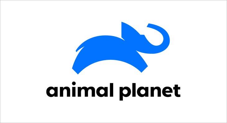
Animal Planet's Poor Redesign
Animal Planet is known as the go-to place to learn about animals. Butthe 2008 logodidn't imply that at all. Animal Planet's logo got rid of the elephant and used text, with the letter "M" in animal oddly positioned on its side. Not only did this take away an important visual of an animal, but the new positioning of the "M" also looked awkward and didn't seem to have much meaning to it.

In 2019,Animal Planet refreshed its brandin honor of the channel's 2020 anniversary. The new branding is fun, fresh, sleek, and still demonstrates what the brand offers. It also brings back an elephant, which was in its earliest logo, shown above.
Creating an Effective Logo
One takeaway that we can gain from all of the brands above is that developing a logo can take time and multiple tries. Even brands with top designers, like Google and Apple, took decades to land on a truly memorable and modern logo.
Even if you think you've landed on a perfect design that's classic, memorable, and valuable to your messaging, it can be helpful to look at what brands around you are doing to modernize, evolve, or improve their own designs. This way, when its time for your logo to get a refresher, you'll be ready with some great ideas.
For more on logo design, check out thisinfographic on 2020 logo trendsorthis helpful guide to designing your first one.
Editor's Note: This blog post was originally published in July 2012 but was updated for comprehensiveness and freshness in May 2020.


Originally published May 14, 2020 9:30:00 PM, updated May 15 2020
Topics:
Slogans & Taglines